


JC POPSICLE|鮮果冰棒包裝設計
在熱氣蒸騰的夏日午後,一口咬下冰棒的瞬間,不僅是舌尖上的降溫,更是一段被果香與涼意喚醒的歡樂時光。JC POPSICLE 鮮果冰棒的視覺誕生,正是源於對這份「純粹沁涼」的深刻想像。
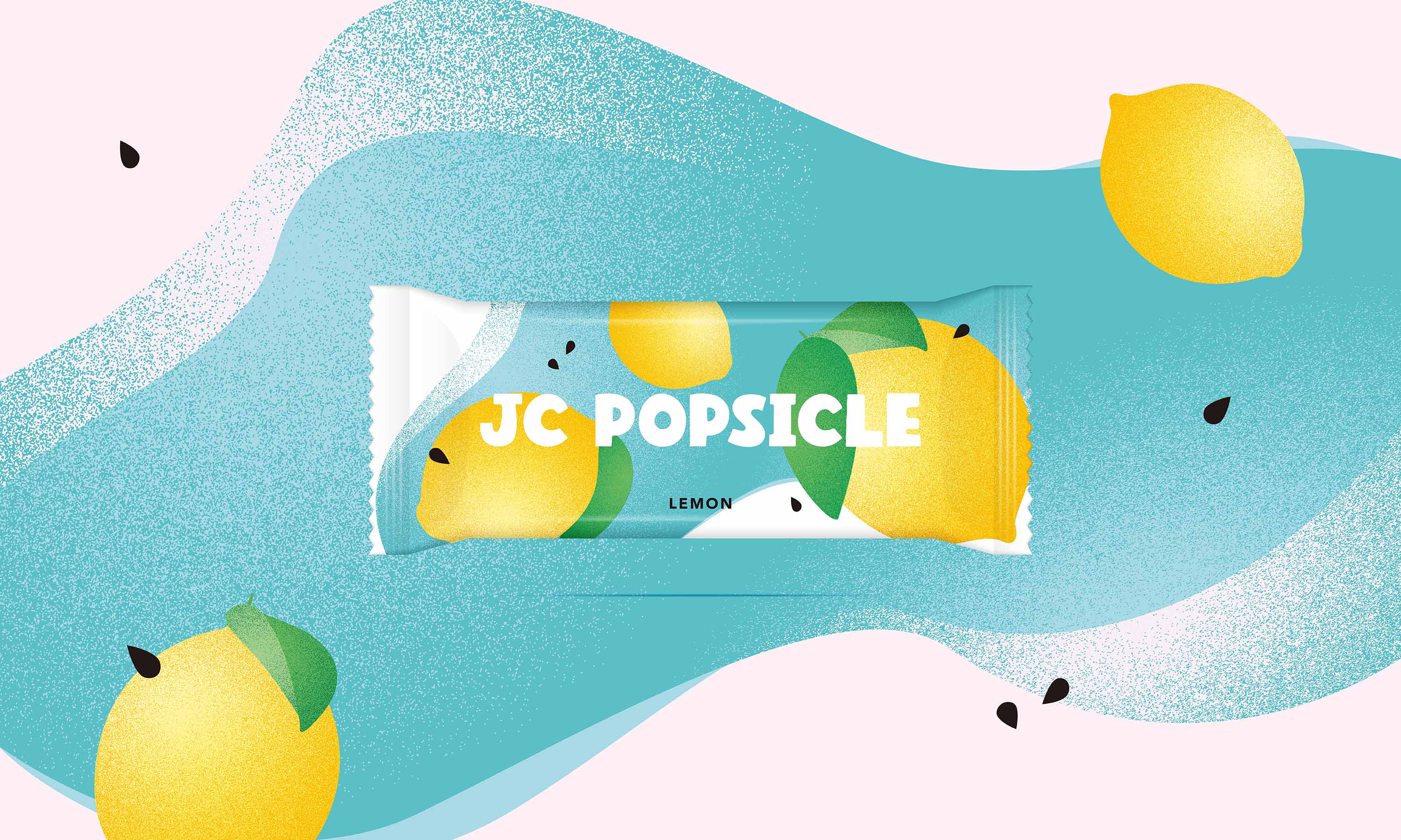
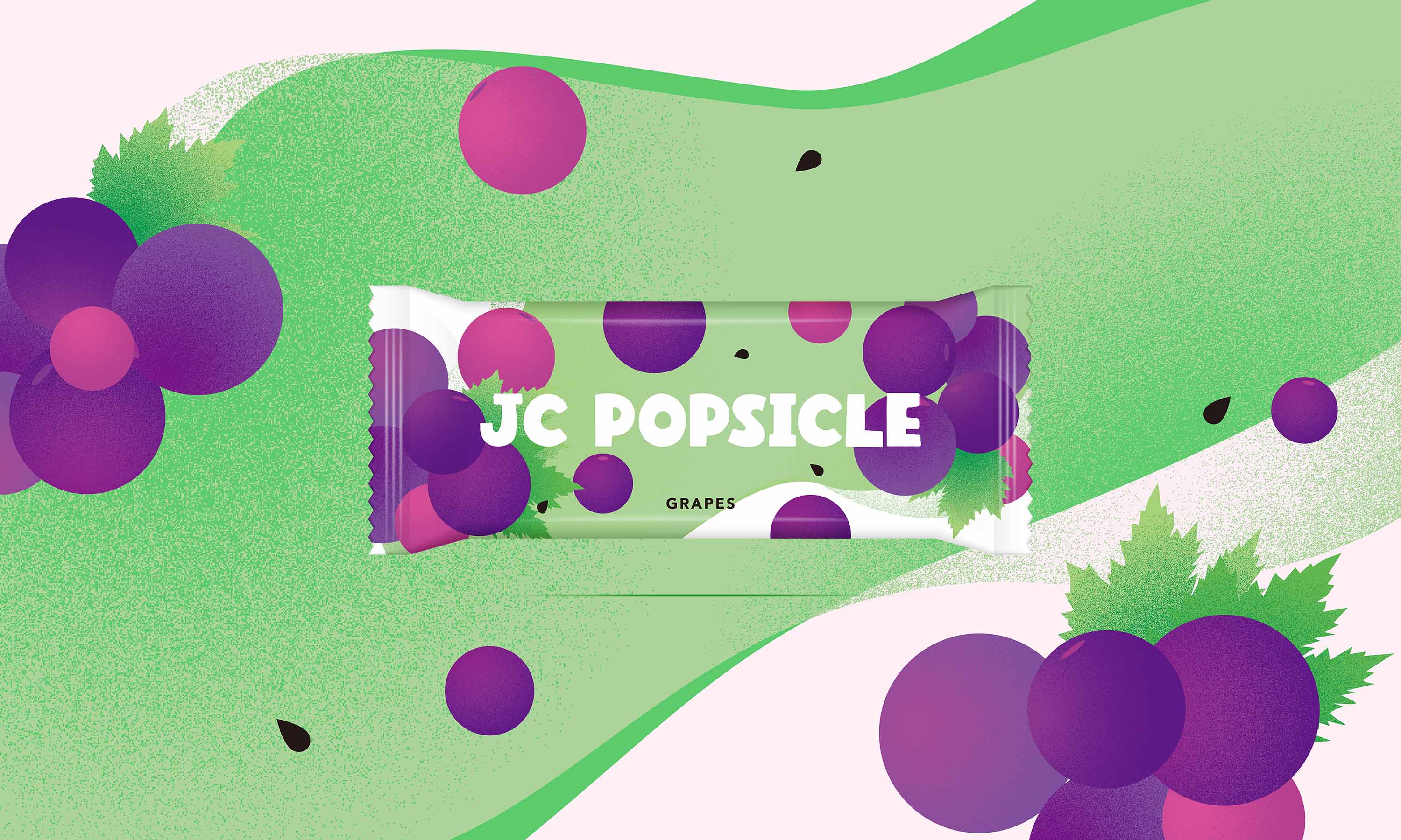
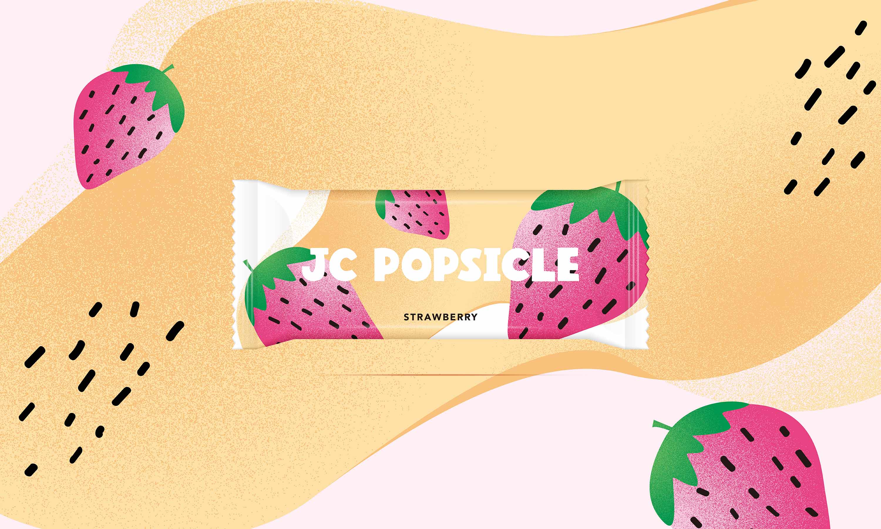
序設計團隊打破了傳統冰品包裝繁瑣且具象的呈現手法,選擇以大膽、帶有幾何感的當代插畫語彙,將葡萄的豐潤、草莓的甜美與檸檬的酸爽,轉化為極具視覺張力的符號。我們在簡約的塊面中堆疊細緻的顆粒質感,搭配圓潤、帶著微胖親和力的中英文標準字,讓包裝在保有童趣之餘,依然展現出當代設計的細緻度。
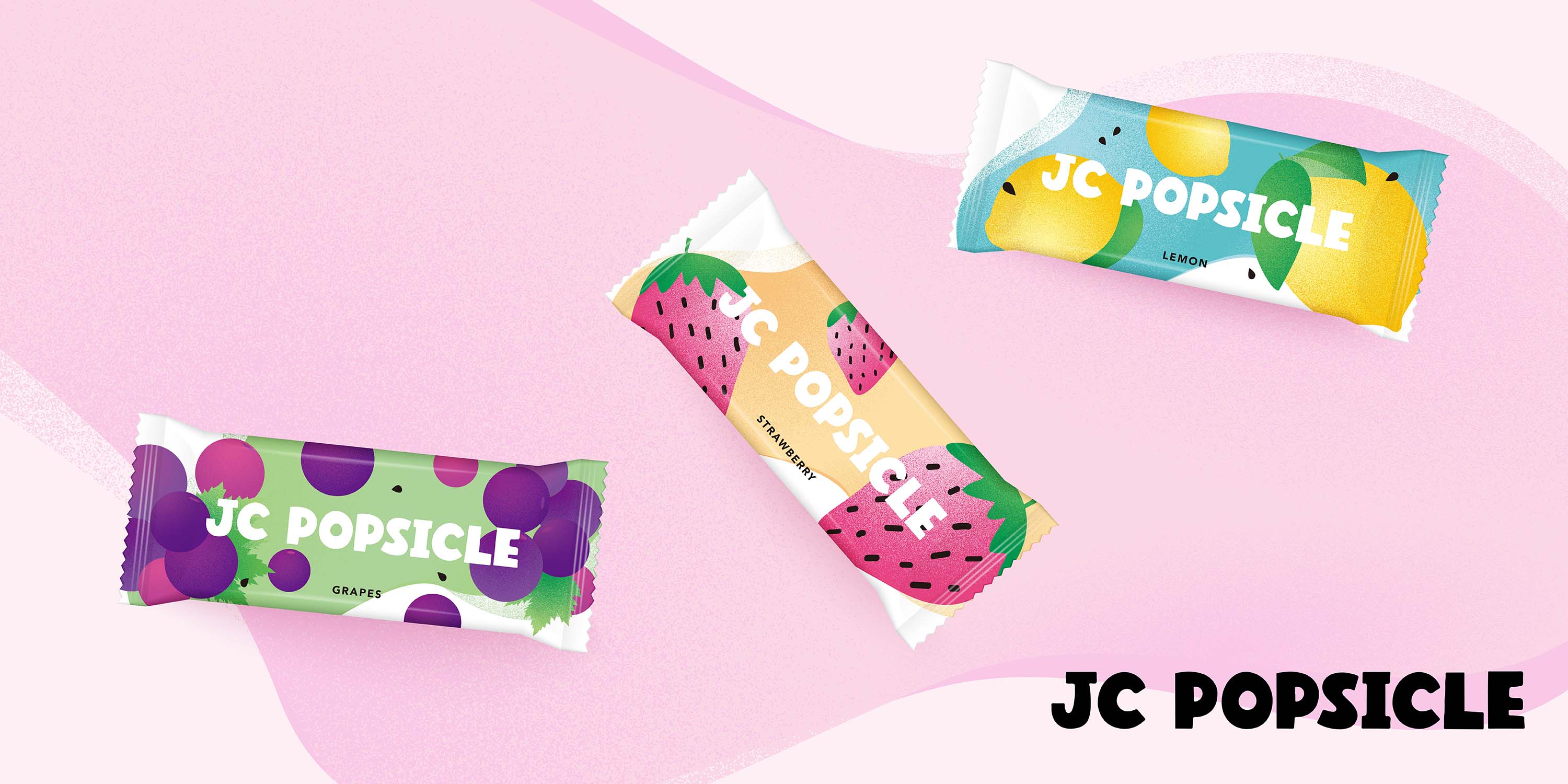
從熾熱的夏日高飽和色彩,到俐落而不失溫度的包裝結構,每一款風味都是一次與消費者的情緒對話。這不只是一套包裝,更是一個能隨著未來風味擴充、持續延伸的品牌家族視覺,讓 JC POPSICLE 在冰櫃中散發著讓人無法抗拒的鮮活魅力,把屬於夏天的純粹美好,溫柔地遞送到每一個人手中。
On a sun-drenched summer afternoon, taking that very first bite of a popsicle is more than just a refreshing chill it is a instant awakening of joy, wrapped in natural fruit aromas. The visual identity of JC POPSICLE was born from this exact pursuit of pure, unadulterated refreshment.
Moving away from the overly intricate aesthetics of traditional ice cream packaging, SHE DESIGN WORKS embraced a bold, contemporary geometric illustration style. We distilled the essence of lush grapes, sweet strawberries, and zesty lemons into vivid, high impact visual icons. By layering clean vector shapes with subtle tactile textures, and pairing them with a soft, friendly typographic design, the packaging exudes a playful charm while maintaining a refined editorial finish.
From the vibrant, sun-soaked color palette to the cohesive structural layout, each flavor serves as an inviting emotional connection with the consumer. More than just a set of wrappers, this design establishes a scalable visual framework built to grow with future flavors ensuring JC POPSICLE stands out on every shelf, delivering a delightful taste of summer straight into every hand.